Blackberry KeyOne Review: Blackberry should have started with this
Blackberry stands persistent with their release on this new device known as the BlackBerry KeyOne.
After the underwhelming launch and life of BB10, the company pledged allegiance to Android, whipped up a strangely cool slider phone, then farmed out production of all new BlackBerrys to external partners. The journey has been difficult to watch at times, but it seems like the transition is starting to pay off. After a pair of all-touch phones, BlackBerry and partner TCL have released the KEYone, heralding the return of the classic candy-bar-with-keyboard design.
The Priv was an ambitious attempt at a flagship,and the DTEK50 and DTEK60 were barely recognizable as part of the line. The KEYone, however, is the first BlackBerry in years to feel, well, like a BlackBerry. Surprise, surprise: It's a pretty great little phone, too. Fans will be glad to know the KEYone is the best Android-powered BlackBerry to date, but I don't expect this to move the needle for many others.
Pros
BlackBerry fans will dig the keyboard
Respectable battery life
Solid mid-range performance
Has the best camera of any BlackBerry
Cons
The keyboard doesn’t make sense for some
Camera sometimes struggles with exposure
Some annoying oversights in software
Cons
Summary
The third time really is the charm. The earlier Android phones BlackBerry made with partner TCL felt generic, but the KEYone is an impressive device that channels the style and functionality of classic models. Even better, the KEYone is a respectable performer with solid battery life. Throw in an excellent camera plus a satisfying keyboard and you’ve got the best Android-powered BlackBerry out there. Just know it’s not perfect: some shortcomings in software are just puzzling, and the market for a phone with a physical keyboard in 2017 is very limited. Ultimately, the KEYone is a great choice for BlackBerry fans and keyboard nuts, but just about everyone else can look elsewhere.
The Design and Hardware
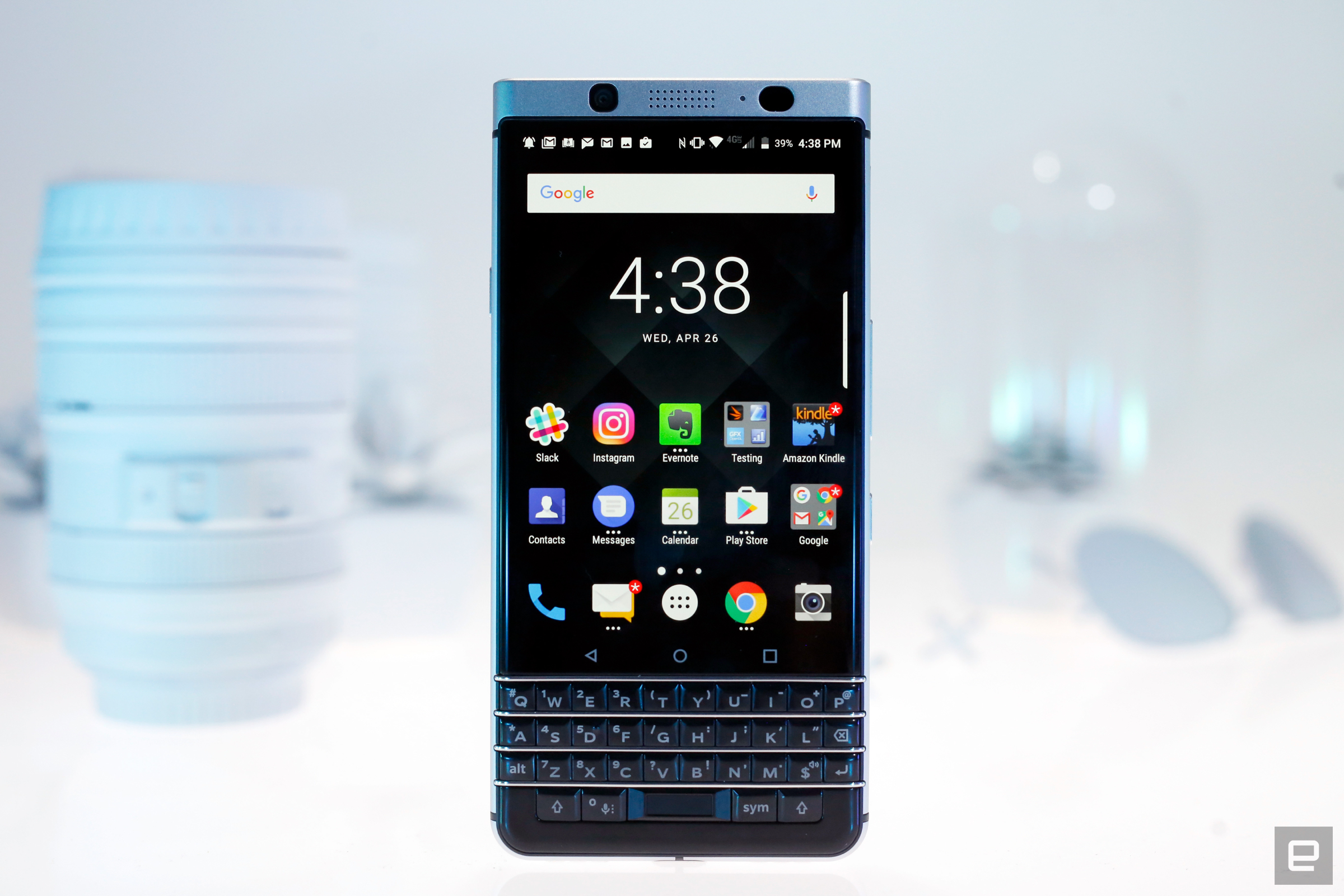
The KEYone is taller than any traditional BlackBerry, with a four-row physical keyboard scrunched beneath a 4.5-inch IPS LCD screen. It's almost the exact same size as a closed Priv, in case you were curious. There's a fast and functional fingerprint sensor here too, baked into the keyboard's spacebar. It might seem like weird placement at first, but it's actually brilliant -- my only problem was that I kept pressing the spacebar expecting it to act like a home button.
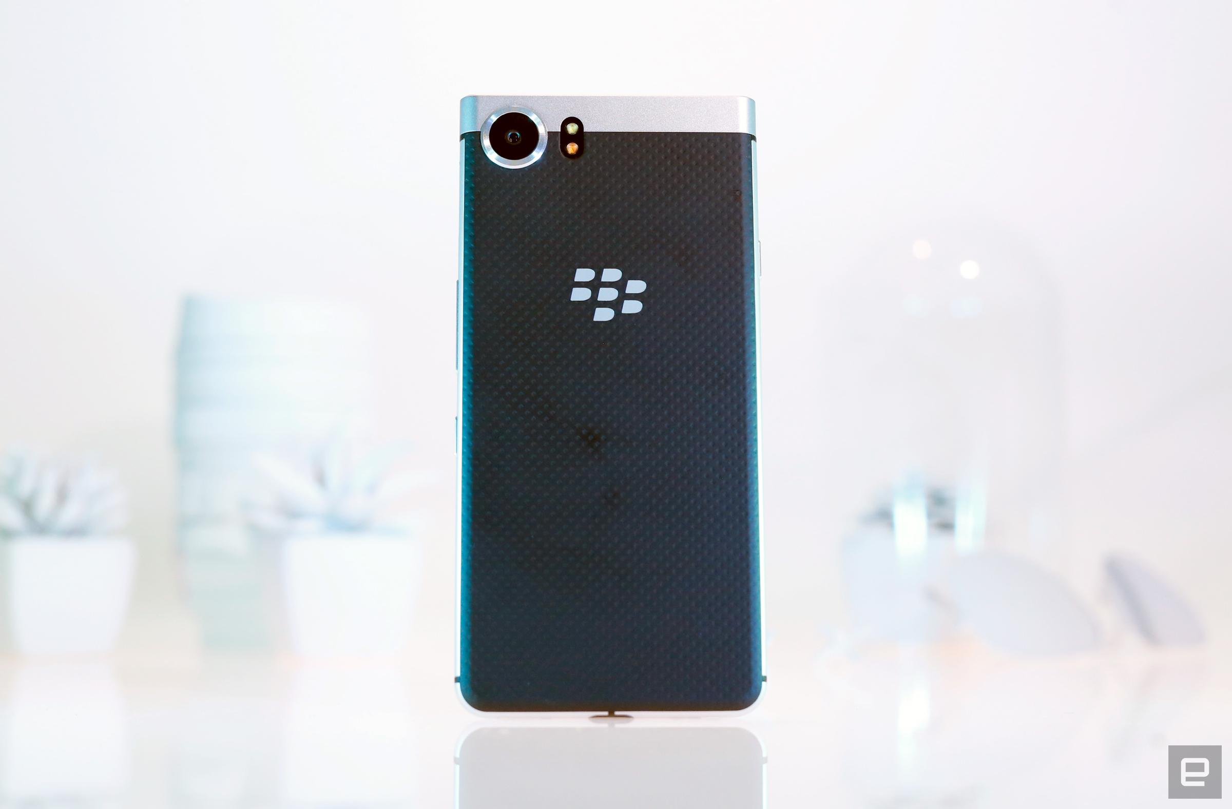
The top is a flat plane where you'll find a headphone jack and, below that, you'll spot the traditional notification LED near the 8-megapixel front-facing camera. All of that is wrapped in an anodized aluminum frame that gives the phone a reassuring feel without adding much weight, and its rounded edges make it comfortable to hold for long periods of time. Flip the phone over and you'll find a soft-touch rubber back speckled with dots and a 12-megapixel camera wedged into the top-left corner. The combination of colors and textures make the KEYone feel classic in a way, sort of like an old camera.
Toss in a re-mappable convenience key, a USB-C port and a microSD slot and you've got the KEYone in a nutshell. I've really got to hand to TCL and BlackBerry on this one: They made a remarkably polished smartphone unlike any other on the market. The KEYone manages to feel professional and productive, and it's proof that you don't need to wedge metal between panes of curved glass to build something that feels premium.
The keyboard
The only way to access a virtual keyboard on the KEYone is to rotate the phone sideways, and even then, you'll then be reaching over physical keys to type on the screen.
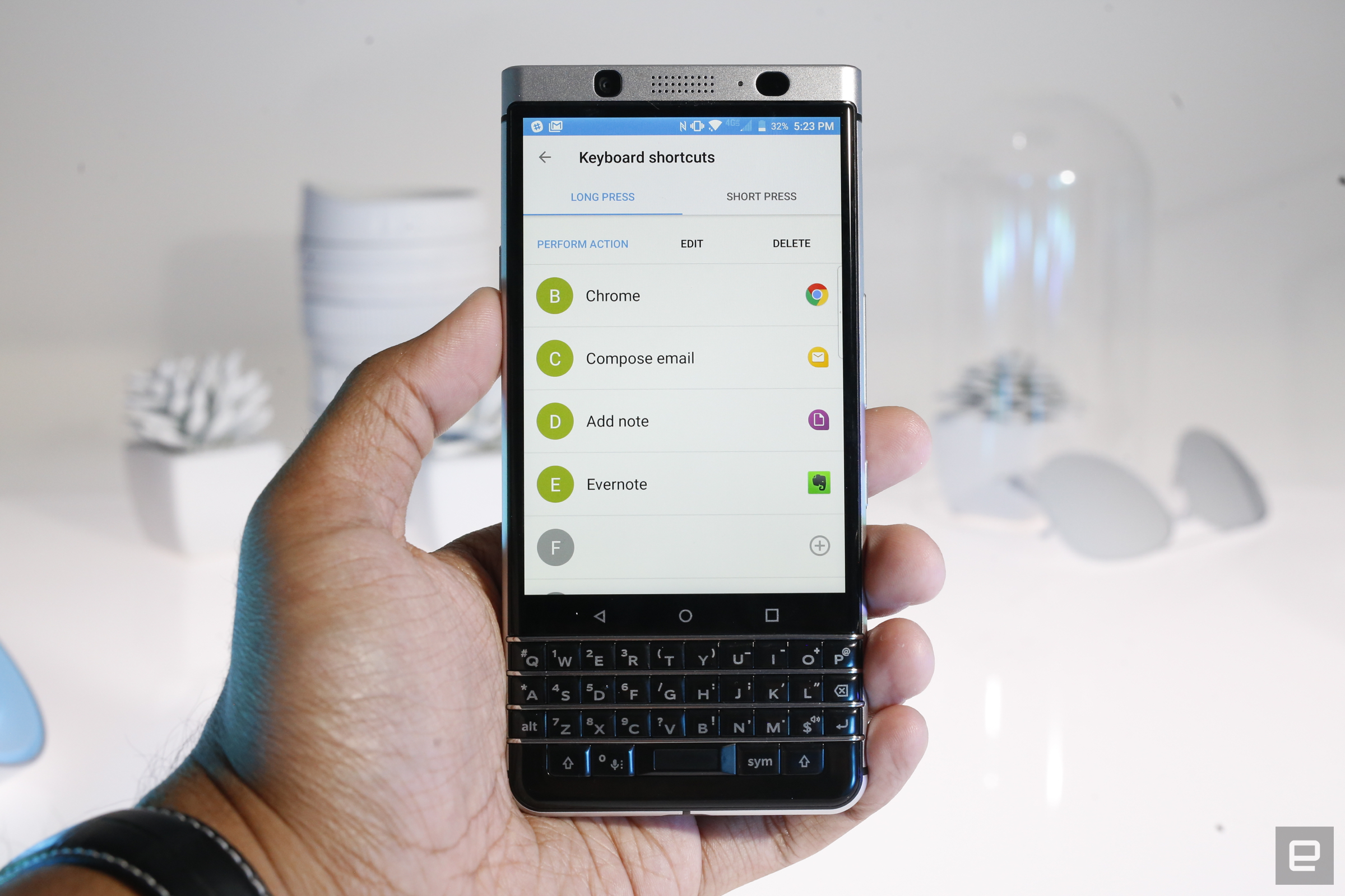
If you put in the time, though, the keyboard is mostly excellent. The keys are small and have just the right amount of travel, and silvery bands separate the rows to keep your fingers from mashing multiple keys at once. Even better, every letter key on this keyboard can be mapped to two shortcuts — you can invoke them by tapping a key or holding it down. This just might be my favorite thing about this keyboard: I can just tap "I" to get my Instagram fix or hold "L" to hail a Lyft.
This isn't any regular keyboard, either. For one, it doubles as a capacitive touchpad, just like the keyboards on the Passport and Priv. That means you can swipe on the keyboard to scroll through lists and web pages, but that doesn't mean you should. The keyboard seems less adept at tracking fingers when held vertically since there's less space for your finger to move, so you're usually better off just using the perfectly good touchscreen.
The KEYone's 4.5-inch LCD has a squarish 3:2 aspect ratio to help accommodate that physical keyboard. BlackBerry argues the addition of the keyboard means more screen real estate while pecking out messages, and that's certainly true. Whether that's a worthwhile trade-off is up to you — I'm not bothered by the smaller screen, but bigger is almost always better as far as I'm concerned. These observations wouldn't matter if the KEYone's display sucked, but it doesn't. It's adequately bright even outdoors, and colors pop nicely. Viewing angles are solid too, no matter if you're holding the phone upright or horizontally. Is it the best screen you've ever seen on a BlackBerry? No (if that's what you're after look at the DTEK60), but it's more than good enough for checking your photos before throwing them on Instagram. The KEYone's two speakers (one on the bottom next to the USB-C port and one up top) were similarly just alright. I spent the past few days using the KEYone as my primary music and podcast machine, and to my surprise, the phone pumped out respectable sound. The KEYone is roughly on par with the Galaxy S8 — raucous rock tends to get muddy on both but songs with brighter highs come out relatively clear.
Software and security

This is the fourth time in two years we've seen an Android-powered BlackBerry, and honestly, little is new on the software front. Sure, the requisite updates are in place — the KEYone runs Android 7.1.1 — but just about all of the features and flourishes BlackBerry is so fond of are still here. Being a purist, I'd normally take exception to all the stuff BlackBerry shoehorned into the KEYone's software. Thankfully, it's mostly helpful. The interface looks stock at first blush, but there's some serious customization going on. Firing up the app launcher, for instance, reveals three tabs that offer access to your installed software (duh), widgets and shortcuts to specific actions like "compose text message" and "add task". There are more than just system-level actions, too; with the right apps installed, you can add shortcuts that create new notes in Evernote or kick the KEYone into driving mode. To make things even more fun, you can map any of those shortcuts to the keyboard's letter buttons. Strangely, you can only map BlackBerry's first-party shortcuts to the convenience key that, well, just isn't very convenient. To our friends in Waterloo: Fix this.

The changes only get more pronounced from there. There's a Productivity Tab lurking on the right side of your home screen; tapping it brings up a handy view of upcoming calendar events, incomplete tasks, unread messages and favorite contacts. It's not quite as useful as Google Now, but I grew to rely on it for triaging work-related deadlines and conversations. The BlackBerry Hub is great for that too, mostly. It's basically just a unified inbox that collects messages and updates from across all your mail and social accounts. Unfortunately, the Hub can get overloaded pretty quickly when you've got Twitter mentions, Instagram likes, emails, texts, BBM messages, missed calls and more occupying a single space. The ability to quickly sift through all your interactions at once is neat, but there's no simple way to clear these events in one shot. The best you can do is prevent certain apps from adding notifications to the Hub or creating a separate "view" that selectively funnels messages from specific apps to you. At this point, we're mostly left with little tweaks. Swiping up on certain icons lets you view its associated widget in a pop-up window, which is way more useful than it sounds. You can install and manage different icon packs right out of the gate. The only major omission is a virtual assistant — there's no Google Assistant or Alexa or even a crappy proprietary BlackBerry assistant. Here's hoping that changes, and soon.
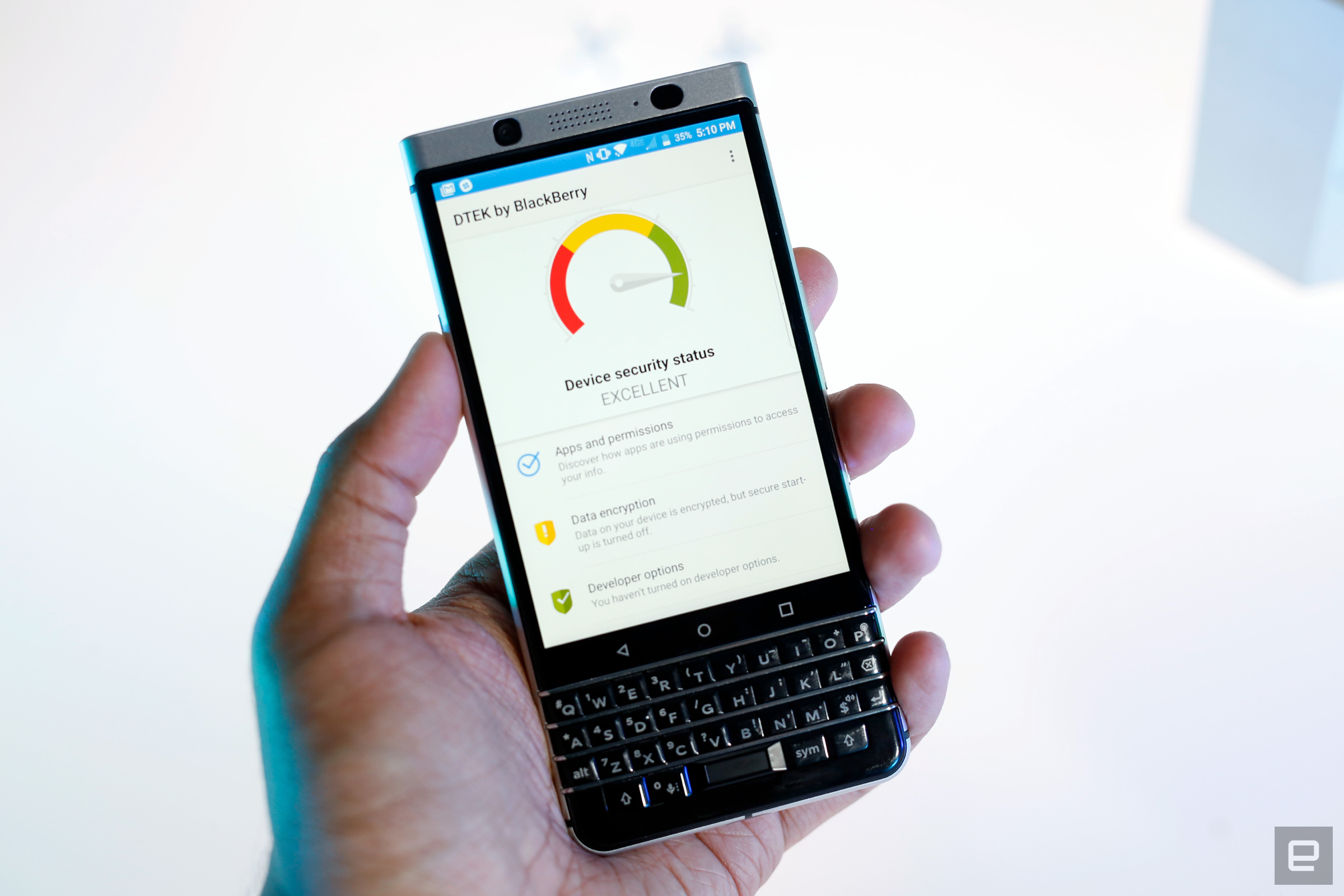
 The list of little touches goes on and on, affirming BlackBerry's love for power users. For the folks who need that extra level of flexibility, the KEYone has you covered. That goes for security, too. According to the company, each KEYone has a hardware root of trust baked into it during the production process, and the devices are fully encrypted by default. You'd never be able to tell just by looking at the KEYone, though — to wrap your head around the phone's security, you'll have to pop into the DTEK app.
As always, it'll give you a rating that signifies how secure your BlackBerry is. My KEYone mostly hovered in "Excellent" territory and yours will, too... unless you hate PINs and install apps from outside the Play Store. More importantly, DTEK lets the really paranoid see how often apps access things like your contacts, microphone and location. And the results are often not what you'd expect. It's no surprise that Google Maps and Twitter have checked my location more than a thousand times in the past week, but I didn't think the DTEK app itself would have checked my location nearly twice as much. In the event you do find something funky, DTEK makes it dead-simple to manage app permissions. Will the average person ever do this? Probably not, but DTEK is a surprisingly understandable crash-course in mobile security, and it's absolutely worth a look.
Camera

Performance and battery life

The BlackBerry KEYone isn't a flagship-level device, so you shouldn't expect it to perform like one. After all, it's a very specific addition to the BlackBerry lineup, and squeezing extra power into a device this niche doesn't make much sense. Instead, BlackBerry and TCL tried to build a phone that doesn't skimp on performance while retaining the battery life of older models. They succeeded. Nestled inside the KEYone is a Snapdragon 625 chipset, an Adreno 506 GPU and 3GB of RAM — together, they helped the phone tackle my daily routine without trouble. This won't come as a surprise to some of you; mid-range chipsets and phones are getting better by the day, and we've seen this combination of components come together really well in devices like the Moto Z Play. There's the occasional wait for an app to pick up where it left off, but it's never enough to make the phone feel sluggish. Things take a turn when it's time to fire up graphic-intensive games like Asphalt 8, though, where you'll notice frames dropping here and there. This is hardly a surprise; devices like the KEYone lend themselves better to productivity rather than play.
| BLACKBERRY KEYONE | MOTO Z PLAY | BLACKBERRY DTEK50 | GALAXY S8 | |
|---|---|---|---|---|
| AndEBench Pro | 6,836 | 8,347 | 5,758 | 15,888 |
| Vellamo 3.0 | 3,253 | 3,314 | 2,741 | 5,519 |
| 3DMark IS Unlimited | 13,654 | 13,514 | 9,529 | 36,806 |
| GFXBench 3.0 1080p Manhattan Offscreen (fps) | 9.8 | 9.8 | N/A | 54 |
| CF-Bench | 54,714 | 54,061 | 49,170 | 67,307 |
| SunSpider 1.0.2: Android devices tested in Chrome; lower scores are better. | ||||
The upside of that modest chipset is excellent longevity. There's a 3,505mAh battery wedged inside the phone; that's just a hair bigger than the one you'll find inside the Galaxy S8 Plus, so there's little chance of being disappointed here. On average, I'd pull the KEYone off its charger at around eight in the morning, and it would often have close to 30 percent battery left by the time I tucked myself into bed. On nights when I neglected to charge the phone, I could squeeze close to another full workday out of the KEYone if I was careful about what I was doing. This is where Qualcomm's QuickCharge 3.0 tech comes into play — it wasn't quite as fast as advertised, but a half-hour charge typically got the KEYone back to 40 percent.
The competition

If you're looking for other smartphones with physical keyboards, your choices are limited. BlackBerry's design sensibilities were at their most ambitious with the Priv, which pairs a nice big touchscreen with a slide-out physical keyboard. The phone's build quality still holds up, but you'd have to deal with dated performance — the Snapdragon 808 running the show is years old at this point.
If you're a big fan of old-school BlackBerry battery life but don't actually need physical buttons to mash, there's always Motorola's Moto Z Play ($449). It packs the same Snapdragon 625 chipset and pairs it with a 5.5-inch 1080p screen and a 3,510mAh battery. BlackBerry's software tweaks are nice, but there's plenty to like about the Z Play's almost stock Android experience. And if you're more concerned about power than security but still absolutely need a physical keyboard, you might want to consider something like Samsung's Galaxy S8 ($750) when its official keyboard case ($60) becomes available. I'm honestly not sure why Samsung keeps making these cases, but hey — the S8 and S8 Plus are the best Android phones you can buy right now.
Wrap-up

I really, really didn't expect to like the BlackBerry KEYone. Sure, I have a lingering attachment to this once-great mobile brand, and I do like a good underdog story. Putting those highly personal things aside, though, and we're left with an objectively great smartphone. Of course, given the years of experience nearly all of us have when all-touch devices, I have to wonder if anyone accustomed to tapping glass would make the move back.
That's not really BlackBerry and TCL's concern, though. This phone won't make a BlackBerry believer out of anyone who wasn't already. For these two companies, the mission was to build a device that blends the best of Android with the hallmarks of BlackBerry devices long past. And you know what? They did it. If you're hunting for a new smartphone and you've ever loved — and I mean loved — a BlackBerry before, the KEYone is well worth considering. If that doesn't sound like you, feel free to move on.


0 comments